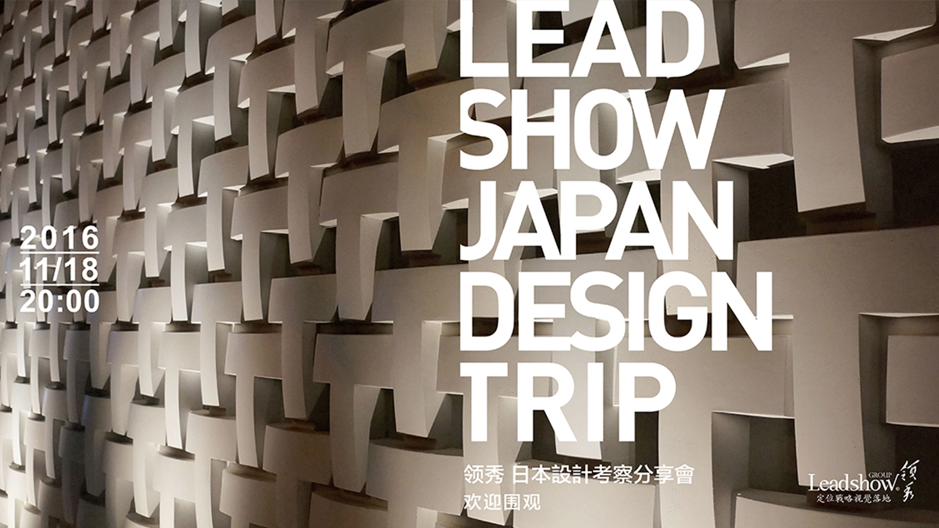
11月18日,晚20:00,领秀在广州国际金融中心ifc3506,举办了一场日本设计考察分享会,这是领秀第一次采用花椒直播的方式,对外分享定位式设计干货,反响棒棒哒!


首先,由领秀韩国回来的“主播”瑨怡开场白,讲述大概的分享内容,紧接着,领秀 “大绳”小观入镜say halo(你说halo我说hi)~,音乐高潮之时,奇哥闪亮登场!铿铿铿~铿锵三人行,全部就位,好戏开始。

日本的设计是细致的、极致的、精致的......值得学习的地方很多,提升我们自身的设计高度!


细致说。


在东京的Bravis公司考察,他们对品牌资产拿捏的相当到位,针对明治酸奶项目,将其原有的品牌资产-蓝色保留下来,并打造为视觉锤,迎合消费者心智烙印。

一切的设计都是为了给潜在消费者优先购买的理由。


领秀的方法如出一辙,对72街的品牌资产保留,都是以消费者心智为基础,唤起消费者心智中的已有烙印。

而对既有品牌711新系列的设计时,需要考虑如何在狭小空间与竞品产生强区隔,他们塑造了超市售货标贴的视觉锤,通过一系列的战略配衬,强化视觉锤,从竞品中脱颖而出。因此,做对的事情远比把事情做对更重要。


领秀应用定位式设计,与汇源强强联合,打造了乐碱高端水、藏净泉天然饮用水等子品牌,这些品牌都是从无到有,我们从定位语、命名、视觉锤......进行了一体化的定位战略视觉落地,赢得了客户和消费者的一致好评。


针对江西鄱湖晨晖农场项目时,我们打造了以前的老味道,提取“菜篮子”的视觉锤,经过定位式设计后的形象,赢得了那英等大咖们的争相购买,半年的营业额增加一倍!
还有立白的闪电视觉锤、九芯净水的两条横线自上而下过滤的视觉锤.....
让听到炮声的人呼唤炮火。这些项目,领秀都是深入一线,和消费者面对面的沟通和交流,寻找消费者心智里已有的认知!

定位式设计,不是以做好看为目的,而是为了目的做好看。


极致说。

21-21明治meiji解剖展。将明治数款具有几十年历史的经典产品,用解剖的方式,讲产品研发、产品概念、产品定位、产品设计、产品包装,用平面和立体作品全方位还原产品的每个阶段,并展示出来。佐藤卓说过:“把设计作为观察事物的方法。如果不知道生产背后的故事,就不会产生想要珍惜使用的情感,会更容易的丢弃还能使用的产品,并且不知道扔掉的东西后来怎么处理了。”

所以说,认真分析到极致,也是一种艺术。


精致说。
日本设计环境。不管是东京印刷博物馆、还是日本的旅游园区、还是日本的建筑环境等等,整体呈现的设计美感,都是相当精致的,带给人良好的体验感。所以,好的设计得有好的体验!
这次的日本之行,学到了很多,领秀会继续夯实定位式设计,向着伟大的目标努力前进!

敬请期待下一次的定位式设计案例分享,听奇哥奇谈,干货一波接一波哟!


At 20:00 p.m. on November 18, leader Xiu held a Japanese design inspection and sharing meeting in Guangzhou International Financial Center ifc3506. This is the first time that leader Xiu has used pepper live broadcast to share positioning design dry goods with great response!
First of all, the opening speech of "host" Ji Yi, who came back from the lead show in Korea, tells about the sharing content. Then, the lead show "big rope" came into the mirror, say halo (you say halo, I say hi) ~, when the music was at its climax, Chico made a brilliant debut! Keng Keng ~ Keng Keng three people line, all in place, good play begins.
Japan's design is meticulous, extreme, exquisite... There are many places to learn, to improve our own design height!
Say it carefully.
In the investigation of bravis company in Tokyo, they have a good command of brand equity. For the Meiji yoghurt project, they keep their original brand equity - blue, and build it into a visual hammer to cater to the mental brand of consumers.
Everything is designed to give potential consumers a reason to buy first.
The way of leading the show is the same. The preservation of 72nd Street's brand equity is based on the consumer's mind and arouses the existing brand in the consumer's mind.
When designing the new 711 series of existing brands, we need to consider how to create a strong separation between them in a narrow space and competitive products. They have shaped a visual hammer for supermarket sales labels. Through a series of strategic matching, they have strengthened the visual hammer to stand out from the competitive products. So doing the right thing is far more important than doing the right thing.
Leading application positioning design, combined with Huiyuan Qiangqiang, has created sub brands such as lechine high-end water, cangjingquan natural drinking water, etc. these brands are all from scratch. We have carried out an integrated positioning strategy visual landing from positioning language, naming, visual hammer... And won unanimous praise from customers and consumers.
In view of the project of Jiangxi Pohu Chenhui farm, we created the old taste, extracted the visual hammer of "vegetable basket", and the image after the positioning design won the competition of Naying and other big coffee to buy. The turnover doubled in half a year!
There are also the flash TV sense hammer of Libai and the visual hammer with two horizontal lines of nine core water purification filtering from top to bottom
Let those who hear the gunfire call for it. These projects, leaders are in-depth front-line, face-to-face communication and exchange with consumers, looking for the existing cognition in consumers' minds!
Positioning design is not for the purpose of looking good, but for the purpose of looking good.
Extreme.
21-21 Meiji anatomy exhibition. Several classic products with decades of history in Meiji are anatomized to talk about product research and development, product concept, product positioning, product design, product packaging, and to restore every stage of the product with plane and three-dimensional works in an all-round way and show them. Sato said: "design as a way to observe things. If you don't know the story behind the production, you won't have the emotion to cherish the use, it will be easier to discard the products that can be used, and you don't know how to deal with the discarded things later. "
Therefore, it is also an art to analyze to the extreme.
Exquisite said.
Japanese design environment. Whether it's the Tokyo Printing Museum, the Japanese tourist park, or the Japanese architectural environment, etc., the overall design aesthetic feeling is quite exquisite, bringing a good sense of experience. So a good design needs a good experience!
During this trip to Japan, I have learned a lot, and I will continue to consolidate positioning design and strive for the great goal!
Please look forward to the next case sharing of location-based design. Listen to Qige's talk, and the dry goods will come one after another!